Monday, 31 May 2010

When I Was Just A Litte Girl

I don't usually enjoy entertaining thoughts of 'the good old days'. Sure, when you're a kid everything is so much easier, so much simpler, so much more in black and white. But there is a lot to be said for growing up and striking out on your own, too. Life isn't life if there are no challenges, right?


Today, my thoughts returned to a project I started at the beginning of the year, but never figured out how to finish. At the same time, on the other side of the world, a stamping challenge ended. And suddenly - too late to enter, but not to be inspired - I had the answers I'd been searching for. The challenge, at Inkurable Stampers, was to make 'mail art' using as many (or as few) of your stamps as you like. Stampers were encouraged to send their mail art, or exchange with fellow stampers. I've chosen to send my mail art to myself... from me, aged 4.


I'd already decorated the box, and cut the envelope pockets for the photos, but these little filing cards lacked a finishing touch.

So I stamped and stamped and stamped, and then I wrote a little bit too, and came up with 'postcards' like this:

I sent myself a few wishes, and a few pieces of advice - all things I've learned from being an adult, but I liked the twist of the innocent child with foresight. I'd even like to think I knew all this stuff when I was a kid, but I just didn't know I knew it. Anyway, thank you to Inkurable Stampers for a nice fat slice of inspiration to help me complete a project. I'll be watching out for their next challenges!

Sunday, 30 May 2010

I Spy With My Little Eye...

a lot of things beginning with 'B'. Oooh, what a great stash of beads I bought, and oooh, what an interesting, jingly, individual necklace I made with them!


It's quite long (navel-length) and very bohemian:


I used a lot of different beads of various colours and materials and tied them into the twine by knotting either side of each group of beads:


The 'pendant', or the bead which helps show me which way up to wear the necklace, is a tortoise bead:

It only took about an hour and a half to make. AND I have leftover beads! More jingly goodness on the way!

Thursday, 27 May 2010

I Had a Dream

The other night I had a really vividly coloured dream. As with a lot of dreams, the contents weren't exactly what you'd call normal. And as with a lot of dreams, it faded throughout the day, but the vividness of the colours stuck with me. I had to put it on canvas in acrylic:


I Decopatched the cloud with newspaper, added some pieces of ribbon, and drew the kite line with a CD marker.

Home is...

Home is a smiling dog. Home is sunshine on the pillow. Home is lots of things. But, home is not a solid place, not a geographical location. It is more a state of mind. From this point of view I decorated a picture frame to hang on the wall near the front door of our apartment:


I Decopatched the frame, using paper from Toga's Ziboux range, and added simple embellishments such as ric-rac, some silky twine, a Cosmo Cricket sticker and a Toga stamp cut-out. The letters spelling 'HOME' are wooden and painted in a shade to match the paper.

I also decorated the backing paper behind the photo, in colours to match the paper:

I actually had to do this because when I took the picture I was convinced the frame was portrait... but no, it is landscape, and the picture was so perfect that I couldn't face waiting and trying to recreate it. Especially the getting-the-dog-to-'smile' part. So, it had to be resized and cropped and it just wouldn't stretch to full landscape. Anyway. Home, sweet home, is where the heart is.

Monday, 24 May 2010

Clean and Simple

Continuing on a theme... yesterday I tried a layout with many layers and bits and pieces and really wasn't happy with it. So I reclaimed the photos and put them away for another attempt later. Instead, I've gone the other way entirely and attempted a page with minimalistic embellishment. I like it. It's not what I usually do, but I can see the effectiveness of using only a few decorations in highlighting the feature of the page, the photo.

I could see this type of page being framed and hung on the wall. For this one I used a scalloped 30x30 page:


I added simple embellishments - just 3 flowers and a tag:

And I tried a paint-spattering method over a swirly mask:


That's it - clean and simple. I'd like to work on this style a little more to add it to my repertoire.


Keep it Simple

More cards... this time for an older male birthday. Mass production is forcing me to keep it simple at the moment, but I think the effect is striking:

Thursday, 20 May 2010

For Once I Remembered

...my parents' wedding anniversary. I think I've managed to get a few cards to them in my life, but I've certainly missed more than I've made. Sorry, parents! Here is 2010's celebration of your happy years together!


I kept it very simple, using only Webster's Pages Sweet as Cherry Pie paper, and personalised it by adding two tags decorated with a cider label for mum, and a maple syrup label for dad:

Tuesday, 18 May 2010

Cotton Candy

My blog might have found its soulmate. Its soulblog, or its blogmate, if you will. Candy Shoppe Designs caught my eye today, and held it for a good hour. Their latest competition, titled Cotton Candy, was too good to ignore. The challenge is to get inspired by this palette:


Well, this is my entry. I chose to make a layout, using a photo taken on my birthday a few years ago. It's called 'Love & Bubbles':

I used some Bazzill cardstock to match the palette, and cut the circle from Doodlebug Designs Inc. 'Cherry Amore' paper.

I really had to restrain myself when it came to the polka dots though... I could've gone to town, but wanted to keep the page bright and simply accent it with black and white.


The competition is sponsored by the Magpie Club, and this is the amazing blog candy up for grabs:

Wish me luck!

Monday, 17 May 2010

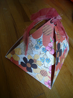
Sneak Peek: Exploding Box

I set myself a challenge at the weekend: make something that fits these criteria:
  • in 3-D
  • with a colour you don't normally use
  • to give as a gift
It turns out I couldn't finish what I began, because I don't have access to the photos I wanted to use. Here is a sneak peek anyway of the very beginnings of what I plan to be a birthday gift for my nan:

I plan to add photos and journalling to both inside layers. At the moment there's just one solitary embellishment:


The paper I decided to cut up for this project was Sassafras Lass Life is Beautiful Woodland Whimsy Paper Garden (outside layer) and Scenic Route Garden Grove Brookhurst Street (inside layer):


All I did was measure a 10x10cm square (9x9cm for the inside layer), and trace 10cm tall triangles (9cm for the inside layer) extending from each side of the square. I cut this shape out and creased the lines, and then stuck the square of the inside layer to the square of the outside layer. I added eyelets to the tops of the triangles so that the pyramid can be tied together with ribbon.

Friday, 14 May 2010

Cute Dinosaurs for a Baby Boy


Toga's super-cute dino stamps have made their way onto a card I've made for a friend... in fact, I made a set of them for her because she has a whole bunch of friends who are expecting babies soon. For this card, I embossed the dinosaurs and used chalk inks for the tree and footprint. The little strip of paper at the base of the card is Scenic Route's Argyle design. I found a really boxy font and cut the words 'new baby' using the Cricut. I wanted to avoid traditional baby-related icons but stay cutesy, and for me these stamps provided the answer.


Tuesday, 11 May 2010

Back to Basics

The next installation in my mini-album rampage is called 'Nature and the Girl'. It's a light-hearted record of a visit to Kew Gardens, London, and my slight apprehension of the great outdoors (which, of course, is a long way from the controlled environment of Kew Gardens!).
I used cardboard - an old cardboard box that was happily decorated on one side (thanks, Ikea, for selling nice-looking but flimsy storage solutions). I painted the other side green, very roughly, so some cardboard still showed through. And then I panicked about Christmas colours... but the autumn colours in the photos inspired my choice of papers and just about brought it back from the brink of Yule.

I kept to one style of journalling throughout, to give the mini-album coherence and consistency, and threw in a few chipboard letters here and there to brighten things up.


I made all the flowers from scraps of paper, fabric samples, buttons and brads, enjoying more and more the rough, haphazard effect.

The papers I used were from the Cosmo Cricket Early Bird range, as were some of the embellishments, and the bird stamps were from Inkadinkadoo.

And it all came about because of the colours in this photo:

Sunday, 9 May 2010

Easy Craft Projects Challenge

I've recently become aware of the ECP Challenge blog, and have decided to enter their Spring challenge. It's my second ever entry to a craft challenge (oh, wait... is this where I should mention my victorious record in primary school craft challenges? Um, well... it was a few years ago... probably should just move on...).

Anyway... my motivation for this creation was that my first winter in Belgium felt soooo long and was soooo cold that I was probably dreaming of spring a little before it arrived. I created this card with a new set of stamps by Artemio and a small handful of new chalk inks.


I like the fact that you can layer the twig and flower stamps, and the way the bird stamp is slightly larger than the shape it was stamped on. I find this card clean and simple, with a definite Spring element to it.

Saturday, 8 May 2010

One-Page Mini-Album

Thanks to Odeline and her tutorial, I've tried my hand at creating a special foldy mini-album, and discovered it's actually a very frugal method. It's made from one 30x30 page, so you don't use much paper; you can add a fair few photos, concentrating the theme and clearing some of your backlog; and it's small, so it only takes a few hours. A great solution for a quick fix!

It folds up like a twisted accordion...


...and it opens out to a full 30x30 page. And because of the way it folds, you decorate both sides, which means double the coverage of your chosen theme:


The pages are small (10cm x 10cm) but you can make them as busy - :

or as simple -:


as you like. I'm now on a mission to make a whole bunch of these little babies as gifts, and my challenge will be to make sure each differs greatly in its colour theme. To the paper stack!

Thursday, 6 May 2010

A Penny for My Thoughts

My fiance's mum has asked me to make her a few cards for upcoming family events. So I got to thinking. I found an old stamp that I'd never used - 'Thinking of You' - and felt it suited the occasions, so I made a few different designs:


Wednesday, 5 May 2010

Play That Funky Music


My fiance has been playing guitar for a few years now, and he's beginning to get up on stage and perform, alone and with musical friends. This page celebrates his passion for music.


The 30x30 paper is Imaginisce Hallowhimsy Lollipop Lizzy. And I found a great font for the title - it's called Coffee Tin: