Showing posts with label Echo Park. Show all posts

Monday, 27 February 2012

The Official Duties of a Bridesmaid

I mentioned here that I certainly asked a lot of my bridesmaids. But even though they had a lot of official duties on the day, I think they enjoyed getting ready with me in the morning. I enjoyed it too, at least until the timing got a little tight.

This double-page layout, made from the sketch below, shows snapshots of us doing our hair and make up on that special day.

Scrapbook Challenges sketch #284
Here's the sketch, up this week on Scrapbook Challenges:


The single pages:

Elements used: Echo Park's Happy Days, Crate's Emma's Shoppe and Cosmo Cricket's Early Bird
Elements used: Prima flowers, Gauche Alchemy stamps
Just want to say thank you again to the polka dot princesses who were so amazing on the day!


Tuesday, 21 February 2012

A Day to be Proud

Such a busy month for layouts! - It's a good thing I have so many photos to scrap these days.

Scrapbook Challenges has another sketch up on the forum - this time, there's a bit of choice, with different photo formats and different size pages. It certainly makes for a good challenge!

I chose this sketch:

why was I scared of this sketch?

...which is actually squashed up a bit in order to make an A4-sized layout - something I normally like doing, but just to be difficult I stretched it out again to fit the regular 12x12.

My layout, I confess, came together very quickly. The reason? I was scared.

Scrapbook Challenges sketch #283b
Why on earth was I scared? Well... I talked (boasted?) here about how my layouts hardly reflect the sketches I take inspiration from these days. BOOM! That was the sound of me falling back to earth. I am trying to keep a 'togetherness' in my wedding photos - for example, I've used a certain Tim Holtz Bitty Grunge circle stamp somewhere on each page (even here, although you can't see it) - and in that framework I just couldn't see any room for manoeuvrability with this sketch. I didn't want to experiment and mess up the continuity of my wedding album. Perhaps I didn't want to distort the sketch too much because I wasn't feeling confident that day. Mainly I just didn't want a dud page in my collection. So I stuck to the sketch like glue and the result is a verrrrrrrrrry clean layout - almost boring, I find.

The colours work, and I changed the matting paper to a frame, but otherwise it's not much different. I get that the challenge isn't to take a sketch and interpret it to oblivion, but I guess judging by my recent interpretations I was expecting a bit more from myself.

At the end of the day, I am happy with it as a page in my wedding album, and since that was my primary objective, I can say I've succeeded! Perhaps a break from wedding photos is in order?

Tuesday, 7 February 2012

Interpretation: The Debate Continues

Following on from my previous post on the Inspiration Debate, I’m going to talk a little bit today about Interpretation, since it’s loosely related to those aforementioned copyright laws and the difficulties involved with intellectual property rights, the internet and so on.

It is very often claimed that any given creation is not a copy of another, it’s an interpretation, which is pretty much like saying ‘it’s OK, I’ve put my own spin on it’. This is OK, until the claims start to be made over creations that are  in fact copies, or uncredited, or both. The problem is that all of this is subjective. You might think something is a rip off of something else, but I might not be able to see it. I absolutely don’t have any answers to this one. Again, it’s a situation that is developing every day, and we are just trying to keep up with the fast-paced changing world of instant online connectivity.

So to completely go the other way and run from the debate, I’ve kind of done the opposite with the layout below. It’s made from a sketch, but it is very loosely based on the sketch. For many reasons (two of them being printer related, causing me to feel like this) I switched things up and did my own thing.

In the past, before I was scrapbooking regularly, I did sometimes look at a layout that was supposedly based on a sketch and wonder how the artist got from sketch to layout, as I couldn’t see any resemblance. Now that I’ve been more active in scrapbooking circles, I see the interpretation process a lot more clearly. And frankly, these days I’m disappointed if a layout is too closely, too precisely based on a sketch – what I find inspiring, like the majority of us, I’m sure, is seeing different people’s different interpretations of a sketch (yep, I used 'different' twice there intentionally). More than that, I find it fascinating that a small group of people like a design team can come up with different layouts for a sketch and no two are even remotely alike.

This is the main reason I love sketches so much these days. Not so much because it takes out of my schedule that extra step of thinking up a design, saving me time; more because the process of getting from sketch to layout is an art in itself.

Look at what I’ve done with Scrapbook Challenges’ sketch this week:

hi, my name's Cheryl and I can't multi-photo scrap

Mine doesn’t look like that. It looks like this:

Scrapbook Challenges sketch #281

I turned the sketch 90 degrees, moved the title position so it diagonally mirrored the original, opted to go for one photo chopped up instead of multiple photos, tried to play around with the title in place of the journalling, and used wavy (literally!) lines instead of straight, moving them from the outside in.

trying to be too clever?
For the title I tried to do something a bit different. (In case you can’t see, there are Heidi Swapp Ghost Alphas on there that spell out ‘Dubrovnik’). It’s (supposed to be) a multi-way title, so you can read it as ‘I love Dubrovnik’, as ‘in Dubrovnik’, as ‘in love’, or as ‘in love in Dubrovnik’. I think I’ll try this again in the future as I didn’t quite get the positioning right on this one (the ‘in’ needed to be closer to the ‘love’, for example, and perhaps I needed to use smaller letters for the ‘Dubrovnik’).

What are your thoughts on interpretation? How far do you like to take a sketch?

If you want to see what the other DT members did, and submit your own layout for a chance to win a prize, visit Scrapbook Challenges. This month, because we feel like sharing the love, there are also extra prize-winning opportunities for new members, so come over and sign up!

Tuesday, 31 January 2012

Wow! Your Parents Really...

When I mentioned here that I didn’t have any resolutions this year as such, but that I did want to scrap more, a very specific part of this wish was to scrap our wedding photos. I can tell you that there won’t be any disappointment or self-flagellation on this front if January is anything to go by – here’s another layout, inspired by this week’s sketch from Scrapbook Challenges. This one’s about my mum and dad at the wedding, and has a frivolous side to it, whilst still remaining stylish and in theme with the rest of the wedding album.

At some point in the build-up to the wedding, my parents were sort of/almost dictating which songs we should have in our playlist. You would think I would have either freaked out, or cottoned on. But evidently I was too distracted. So when the first of their requested songs came on in the evening, and they picked up their feet and started jiving – yes, jiving – my jaw hit the ground like Sebastien the Crab’s in Disney’s The Little Mermaid. When we finally got them off the dance floor they admitted they’d been having secret lessons in the build-up to the wedding. In fact, they went to such lengths to hide the lessons from my brother, who lives at home right now, that they told him they were going out to marriage counselling!

They really got on board with the whole 50s-ish theme – and they loved it. AND they looked incredible. This fact was not missed by anyone – one of our friends said to me, in that voice that sounds surprised because it’s generally unexpected that such a possibility could exist, ‘Wow, your parents really have style!’… and so the title for this layout was born.

The sketch – yet another great one from Scrapbook Challenges:

this is one of THREE different takes on the sketch on offer this week
 And my interpretation:

Scrapbook Challenges sketch #280

Tuesday, 24 January 2012

Our Brilliant Stars

When we were planning our wedding, we knew from an early stage that more than mere observers, we wanted people to be involved in the wedding. So in our intricate detailing of how our day was going to pan out, we included a lot of people, and from those people, we asked for quite a lot of things.

I’m sure it’s fairly normal to ask family members to help out – all of my family decorated the venue for us on the day, my mum made all the cakes the day before, and his close family hosted welcome drinks for guests the night before – and when it comes to the bridesmaids and groomsmen, there are pre-set, etiquette-driven, certain particular tasks that fall into what you would call the ‘normal’, ‘standard’ or ‘to be expected’ category. But what we asked of our bridesmaids and groomsmen went beyond the norm – then again, our whole day did, too.

We assigned certain responsibilities to each of them, such as asking one of the boys in braces to be the music monitor; we got the polka dot princesses to manage the quiz during dinner by collecting and marking the answer sheets; they all ushered the tables into the ceremony room for our own personal ceremony after dinner; and they each invented and asked vows to the bride and groom to make sure we were going to look after each other. They did a lot more besides this – an awful lot. For that we are eternally grateful, and so touched by the distance they went for us.

It’s for this reason I wanted to make this layout a fairly uncomplicated page: to show off the simple fact that we are so thankful for these friends and what they shared with us on our wedding day; they really were superstars. The true meaning of friendship came out on that day and we will not forget the feeling of immense pride and joy at having these people present at our wedding.

It’s another Scrapbook Challenges sketch – up this week on the forum – in fact, I designed this one myself (except Brynn, SC Queen Bee, jazzed it up and made it look all snazzy like that):

it didn't look this good when I handed it in
The double-page version looks like this:

i tried smooshing it all onto one page, but it's better on two

And a rare double-pager from me looked like this:

Scrapbook Challenges sketch #279
Using only Bazzill cardstock and MME Quite Contrary patterned paper, a few snips of Happy Days paper, alphas and journaling cards, some Happy Days and For the Record stickers, AC Thickers and Bitty Grunge stamps from Tim Holtz to get the circles into the layout, I created a panorama of what I hope is love, gratitude, awe, respect and happiness.

they really were superstars!
Thanks, you lot, for helping to make our wedding day so awesome. We will not forget. x x x

Sunday, 22 January 2012

Guest Creative Scrapper

And so for the exciting news!

Kristine at Creative Scrappers contacted me last year to see if I wanted to be a guest on their blog... and of course I said yes. Why would I say no when the blog is just about my favourite source of sketch and layout inspiration?

You can read my guest post on the Creative Scrappers blog but I'll show you what I made with sketch #192 here:

Creative Scrappers sketch #192
Our first engagement photoshoot was uncomfortable for me. I am not great at posing and really needed to be directed more strongly. Out of 500 photos there were about 50 I liked, and about 30 made it into the final collection. Which all makes me more happy that we got this one - full of attitude, looking totally comfortable and acting quite the poseurs.

rockabilly say yes!


The page is a memory of our discussion about props: he had his hat, I had my handbag... and then at the last minute I said 'Bring your guitar!'.

me and him, in object form
Echo Park collections make up the majority of this layout - I seem to have kept scraps from Life is Good and For the Record which match well with Happy Days. You'll also find some Lily Bee, Crate and Jenni Bowlin in there. Credit also has to go to Basic Grey for their postal stamp... don't you just love the black on black of the heat embossed postmark?

I'll be using this technique again
A big thanks to Kristine for asking me to be part of the Creative Scrappers scene! If you haven't heard of them already, you should go check them out now. They are really very, very good.

Tuesday, 17 January 2012

Hold On Tight

Well I hope everyone enjoyed the SC Blog Hop - there were certainly a lot of you hopping around and leaving comments! More Scrapbook Challenges today - I have sketch #278 to share with you.

Participating in the weekly sketch challenges can earn you the title of Pick of the Week or even win you a prize. Most importantly, the sketch itself and the layouts made by the DT can go a long way to nudging you out of a creative rut or giving you the confidence to try something new.

If you've been hanging around here for a while, you'll remember my horror story about my wedding hair. I won't go over that again (if only to avoid the pain of recounting it) - at least not entirely. But now I've made a layout about it, it's kind of hard not to retell this aspect of the wedding day.

I think my hair and make-up girl fainted when she heard the driver of the caddy say 'since we're running late, we'll have to take the big roads' - big roads being the inner city ring, which dips up and down and in and out of tunnels, and is two, three and sometimes four lanes wide. She assured me the style would hold (what else could she say?) but I think it was the major disruption to traffic flow caused by the beer festival that saved my curls: after we got off the ring, every road we turned down was blocked, leading us onto progressively smaller and slower roads. Going slower meant less wind, and less wind meant precious moments more of preserving my carefully curled wedding hair.

The photographers followed behind us in the car and sneaked this shot of me and my mum holding on for dear life:

Scrapbook Challenges sketch #278

I used Echo Park's Happy Days collection primarily for this layout, but you'll find some Crate (Restoration), Lily Bee (This & That), Melody Ross and American Crafts in there as well.

love that AC ribbon

This is the sketch - create to your heart's content and upload to the SC gallery - but always remember to hold on to your hair!


Thursday, 22 December 2011

Give a Girl the Right Shoes...

...and she can conquer the world. 

(Marilyn Monroe)

A long, long time ago, I started a blog. On my blog I wrote my first post. And in that post I wrote a poem about shoes. I've blown away the dust, so you can read it here.

Fast-forward to 2011, and things have changed somewhat. A wedding on the horizon produced the necessity for both the bride- and groom-to-be to buy shoes. Usually, when it comes to weddings, no expense is spared; but we are sensible people, and know our limits. We also knew what we wanted from our respective wedding shoes.

So, while he secretly broke in his shoes by wearing them around the office, I secretly practised teetering around in mine at home.

Creative Scrappers sketch #187
Mine were grey felt with a scottie dog patched onto one; his were black and white and shiny. They certainly produced a lot of 'ooohs' and 'aaahs' on the day.

and dance we did
On that special day, it wasn't just about a girl and her shoes - it was about a boy and his, too. And you know what? We both knew we'd chosen the right shoes, and we both felt that we could conquer the world.


Thursday, 1 December 2011

New Paper

I got a delivery at the end of last week. It was a very exciting delivery, because it embodied at least three things in one.

It satisfied the need to impulse buy that sometimes befalls all of us; it pulled together lots of papers I'd been looking for for a while; and it appealed to the part of my brain interested in wallpaper patterns. In short, it was perfect.

And what did it look like? It was this:


And with it, I did this:

bliss indeed
It makes me so happy to look at it and remember the feeling of the first day of our honeymoon - euphoria, triumph, love, satisfied exhaustion, excitement, anticipation... and more, so much more.

I can spot 3 Gauche Alchemy goodies in this shot
And I suppose it makes me a little sad, too - so brief, that first day, and soon the honeymoon was over, and life began again. But memories are there for enjoying, and that is what this page does.

Monday, 14 November 2011

Happy Days

We'd already been planning our wedding for a long time when Echo Park's Happy Days collection came out. To be honest, I was so consumed with making wedding decorations that I hadn't really thought ahead to what the post-wedding scrapbooking would be like. Echo Park saved me the trouble, in the end. More than that - it was a match made in heaven.

Of course, recently I've been getting stuck in to that post-wedding scrapping, recording our happy day.

This layout you've already seen:

Materials used: American Crafts Thickers (Rainboots in Aqua Glitter Foam); Bazzill White cardstock; Echo Park: Dots and Stripes in Concrete, Happy Days chipboard accents, Happy Days element stickers, Happy Days journalling cards, Happy Days paper (Checker Board, Little Flowers reverse side); My Mind's Eye paper (Lost and Found Union Square Perfect "Happy"); Tim Holtz Bitty Grunge stamp set.
{Scrapbook Challenges Sketch #271}

I stitched and stamped before sticking down the paper strips. Then I added a printed swallow, a Cricut-cut nautical star and an RSVP - all from the wedding invitations - as extra memories. Finishing off with Happy Days chipboard shapes and Thickers was a doddle.

Why so easy? Well, Echo Park has pretty much decided my theme for me - I still want to be quite free and 'different', but I do want to have some main colours and motifs running through the pages. And Happy Days is perfect - you've seen the photos of the wedding. It should help me reach that subtle theming I'm after.

I made another Happy Days layout last week - taking into account this layout too, do you think I've achieved continuity?

Materials used: Bazzill Dragonfly cardstock; Echo Park: Dots and Stripes in Concrete, Happy Days alpha stickers, Happy Days element stickers, Happy Days journalling cards, Happy Days paper (Checker Board reverse side); Gauche Alchemy Punchinella;Tim Holtz Bitty Grunge stamp set; Toga alphas; vellum.
{Creative Scrappers sketch #181}

For the border, I cut up the remains of this chequered vellum I've had for years and machine-stictched it on, then drew a couple of extra outer lines with a black pen. To make the chevrons, I cut a strip of the reverse side of Happy Days Checker Board paper, and then cut this strip into squares. Keeping the squares in a line, turning every other square 90 degrees gave the rough pattern; then it was just a question of lining the stripes up and trimming the edges. I did the same with the Dots and Stripes paper.

yummy!

Since we went for cupcakes as the wedding cake, the Happy Days element stickers had to be used: cupcakes, layer cakes and sundaes - yummy! I cut around the cake on the journalling card a little so it could stick out over the photo. Then the title - punchinella, more chevrons, and lovely pure alphas.

And finally, my piece de resistance this month...


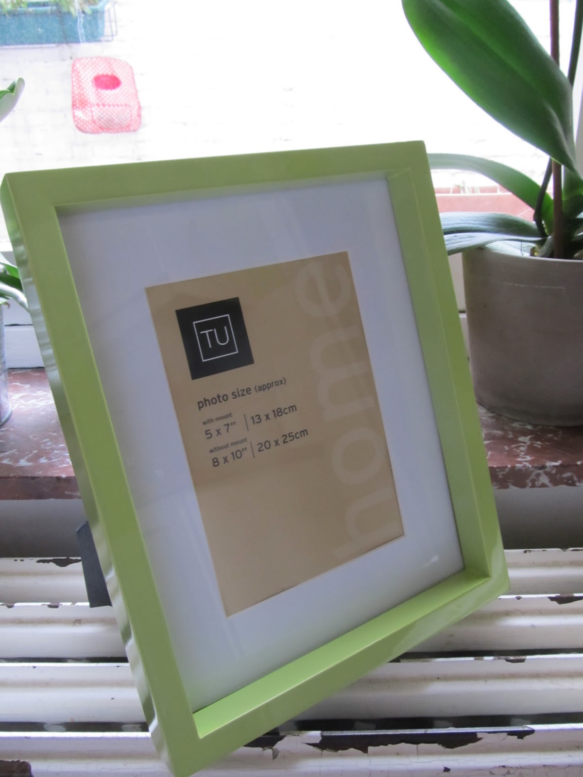
....take one deep photo frame from a well-known supermarket chain, take it apart, and make it your own!

Materials used: Echo Park: Happy Days alpha stickers, Happy Days chipboard accents, Happy Days element stickers, Happy Days paper (Ads, Retro both sides); Gauche Alchemy Punchinella and various Mixed Media Color Kits elements.

The frame comes with a super-thick inner mount that is quite wide, providing a great working surface. I drew around the mount directly onto the patterned paper and then simply cut out the shape I wanted to partially cover the mount. I did a teensy bit of fussy cutting to get the Retro flowers; glued some GA elements onto some thin wire and stuck them down behind the big chipboard title; and then just layered the rest up.

because the frame is so deep you can really go to town on the layering

on the subject of matches made in heaven... look at this Echo Park Happy Days chipboard accent with a vintage mini film negative from a Gauche Alchemy Mixed Media Color Kit


Tuesday, 25 October 2011

Caddy Love

Lily Bee Designs are starting to offer sketches for inspiration - and they're good.

I joined in with the first one by creating the second ever page of my wedding album. This was the sketch:


For over two years we had known which car we wanted for our wedding. And for over a year it had been booked. It was a 1956 Cadillac Sedan de Ville... this 1956 Sedan de Ville:

*sigh*

Why the sigh? Because at midday on the day of our wedding, I received a phone call from the car company, saying that the Sedan de Ville wouldn't start.


look! look how calm I am!

I went into Seriouser than Serious mode. The company offered me, instead, a Rolls Royce in silver or a Jaguar in British racing green. There was no way I was letting this slip away from me - the car was a big part of our vision, and my underlying desire was always only for everything to be coherent - so of course, I simply said that no, neither of those options were any good. That's when the company told me that they might have another Cadillac... it was from 1960, just about on the edge of what would work for me. It was also from the higher price range, but they would provide it at no extra cost. Naturally, I said. Then I heard the word 'tailfins' in my ear, and I was sold. Relieved, too.

Less than an hour later, the Caddy turned up. It was only at this point - while I am having my hair painstakingly put in place - that we discovered it had no roof. Now, I can look back and laugh at how I've always liked the windswept look. But on that day, at that moment, the journey to the Town Hall (we were running late, and there was an annual Beer Festival taking place which meant road blocks and diversions on top of that) was the most stressful of my life* because the wind in your hair is nice and all, but not what you want on your wedding day.

Anyway, back to the layout. I wanted to stitch on my page. I've cleared the way to the sewing machine again so I can stitch on my pages once more. But for me, to stitch the circles would've been too obvious. So I brushed on some acrylic paint, didn't like the look of it, and smudged it with a cotton wool pad. And then I was happy.


see them circles and stars again...
I used some paper and stickers from Lily Bee's Picket Fence collection, and combined them with Echo Park Happy Days bits and pieces, with some sparkly Thickers thrown in and Tim Holtz stamps.

still loving those nautical stars I made for the invitations
I didn't win the sketch competition, but the sketch was a great starting point for a layout that I'm happy with. 

The official photos have arrived now so I'm planning, planning, planning... how many pages can you fit into a post-bound album?

*coming in a close second is the one on which we transported my fish in their bowl from Norwich to Brussels by car. They learned about tidal pull that day; not to mention a little surfing. One of them was so traumatised it jumped right out of the bowl that evening after we'd arrived and went to fishy heaven (which was either somewhere under the sofa or in the doggie's stomach).